I have long been struck by the work of the Situationist International, and this survey of Mark Bradford's work at the Museum of Contemporary Art in Chicago was an instant connection to that movement.
"They imbue you with this sense of security, and at the same time they are deeply, deeply flawed." Bradford's response to this disconcerting reality are these collaged representations of his experience as a "modern day flaneur." I am reminded of SI psychogeographic interventions, of using a London map to navigate the Harz region of Germany. Or jumping ahead a few decades to Michel de Certeau's practice of "Walking in the City," and the creations of one's own geographies through mere movement through space. These works are both beautiful and thought provoking-- complex questions grounded in, and responding to, the false security of the mappable, "image-able" city.
Please excuse the poor quality of the photos, they were hastily taken at this exhibit in June.
see more at: http://mcachicago.org/exhibitions/past/2011/239
Tuesday, November 08, 2011
Wednesday, July 20, 2011
Monday, April 25, 2011
Creating a Language
Linda Pollak's "Cuts and Patches" from Urban Omnibus, 2010.
These images, which were compiled from the sidewalks of lower Manhattan, appear as a surprisingly consistent set of geometric configurations. There may not yet be a semiotic association with these found objects, but they remind me of the book, A Pattern Language by Christopher Alexander. I can't seem to find many images of the book online, but here is an excerpt entry on Alexander's website. What is the symbology of the sidewalk's "cuts and patches"? How can we come to read the ordinary as something more extraordinary?
I am impressed by the beauty these patterns assume when published as such, and I am taken by Pollak's assertion that "As a designer, the more you can make sense of the diversity of the physical environment, the more chance you have to enable others to make new sense of it." I'll toast to that.
Miniature Worlds
In my sculpture class this morning we were prepping for presentations on our semester final: "SITE." More on my idea later (it involves periscopes and is situated in Kevin Roche's Center for the Arts at Wesleyan), but I have been inspired by my childhood fascination with the Thorne Rooms at the Art Institute of Chicago.
These rooms give the most detailed entry to another time, another world, from the perspective of a larger-than life voyeur. As kid you could stand on a ledge, tip-toe as high as posssible, and look into the meticulously placed artifacts, all rendered to extreme accuracy and no bigger than your thumbnail.
I loved it. I wanted to recreate them. I didn't care about playing with dolls themselves, but I wanted the dollhouse. To that end, I went about creating furniture that would be fit for a small fairy, and complete with miniature french toast for breakfasts-in-beds.
Now I would love to make miniature to-scale models of some of Roche's modernist influences on his work at Wesleyan, such as Mies van der Rohe's Illinois Institute of Technology in Chicago or Erik Gunnar Asplund's Woodland Cemetery in Stolkhom. But for now I'll just have to settle for more views into 19th century English homes.
More Thorne Rooms from the Knoxville Museum of Art on this flickr photostream.
Growing Graphics
I recently remembered this map I made depicting the crops planted on our main acre at Long Lane Farm. The map is incomplete, and I think it could use some revising graphically/typographically speaking.
(click for larger image)
I like the contrast of this image with actual farm photographs posted on this blog almost 2 years ago. That summer I also attempted some sort of logo for the farm, which I ended up printing onto tote bags. I wish I had a photograph of the tote bags I made, but this was my first attempt at graphics for the bags:
Saturday, April 09, 2011
Opportunities
I'd love to be able to go to this international conference for young urban researchers. Too bad I'm about to sign away my next year to a job. Or that the conference is in Portugal.
Poo.
Poo.
Saturday, March 26, 2011
Sea Forts
I thought the romance of long lost battle sites and wartime infrastructure was lost on me, but alas--
these have me hooked:
 The long abandoned British marine defense cubicles known as the Redsand Towers. The immobile and steadfast nature of these boxes, weathering under the relentless ocean-- it all screams the setting of some incredible psychological thriller, or maybe the base of some love-lost soldier.
More gorgeous, forlorn photographs from Max Nathan, the author of this blog and a research fellow at the LSE Cities Programme.
these have me hooked:
 The long abandoned British marine defense cubicles known as the Redsand Towers. The immobile and steadfast nature of these boxes, weathering under the relentless ocean-- it all screams the setting of some incredible psychological thriller, or maybe the base of some love-lost soldier.
More gorgeous, forlorn photographs from Max Nathan, the author of this blog and a research fellow at the LSE Cities Programme.
Monday, March 07, 2011
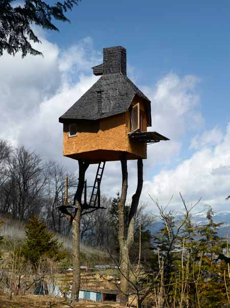
Tea House
I want to climb up into a special room with a beautiful view, away from all my clutter.

Terunobu Fujimori’s Takasugi-an tea house in Chino, Nagano Prefecture, Japan.
Photographed by Edmund Sumner.
more

Terunobu Fujimori’s Takasugi-an tea house in Chino, Nagano Prefecture, Japan.
Photographed by Edmund Sumner.
more
Not to be forgotten

The Pulse Room by Rafael Lozano-Hemmer is one of my favorite installations captured on camera. Each light bulb is synced to the pulse of an individual who comes through the room, with the last 100 heart beats still pulsating through little energy-filled balls of light.
The idea of our individual rhythms having an impact on the space we occupy has stuck with me. I sometimes imagine that the blinking lights of radio towers are powered by our own heart beats-- together theirs rhythms are oddly synchronous, yet ever off-kilter.
more on the pulse room
Subscribe to:
Comments (Atom)


